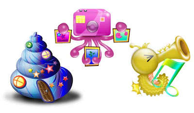
PIXEL

VECTOR
Comments and suggestions are very much appreciated. ^^
1) Can you tell its theme?
2) Is it suitable to be an icon?
(YES/NO)
3) Are you able to tell out what the icon represents?
(YES/NO)
4) How's the colour composition?
(unexplainable/bad/average/good/grEAT!)(opinions)
5) In what category is the first picture on the left of PIXEL in?
a)gallery b)lolipop c)home d)contact
6) How would you rate the pixel's? (0/5)
7) How would you rate the vector's? (0/5)
8) How's the overall impression on the icons?
9) Would you adopt it as yr destop icon?
10) What can be improved on for the icons?
Thank you for participating in this questionairre~

VECTOR
.jpg)
Comments and suggestions are very much appreciated. ^^
1) Can you tell its theme?
2) Is it suitable to be an icon?
(YES/NO)
3) Are you able to tell out what the icon represents?
(YES/NO)
4) How's the colour composition?
(unexplainable/bad/average/good/grEAT!)(opinions)
5) In what category is the first picture on the left of PIXEL in?
a)gallery b)lolipop c)home d)contact
6) How would you rate the pixel's? (0/5)
7) How would you rate the vector's? (0/5)
8) How's the overall impression on the icons?
9) Would you adopt it as yr destop icon?
10) What can be improved on for the icons?
Thank you for participating in this questionairre~
1) Can you tell its theme?
ReplyDeleteUnderwater Elements
2) Is it suitable to be an icon?
Yes
3) Are you able to tell out what the icon represents?
Yes, but home is a little hard for both pixel and vector.
4) How's the colour composition?
Above average. Not too sure what to suggest for the colours, it's not bad, but I think still need to explore on more colour options.
5) In what category is the first picture on the left of PIXEL in?
c) home
6) How would you rate the pixel's? (0/5)
3.2
7) How would you rate the vector's? (0/5)
3.8
8) How's the overall impression on the icons?
3.5. Might need some major alteration of the pixel home.
9) Would you adopt it as yr destop icon?
Yeap,especially the octopus and seahorse. Love them to the max for both vector and pixel.
10) What can be improved on for the icons?
I thought there would be shadows. Probably some problem came up when u upload it. Anyway, shadows would definitely help to improve your icons. And yeah, for pixel de, octopus in purple colour and red hat, a bit like mangosteen eh. haha.
1) Can you tell its theme?
ReplyDeletesome sort of underwater theme
2) Is it suitable to be an icon?
its suitable to be 6 icons actually
3) Are you able to tell out what the icon represents?
yes, other than the pink pixel icon
4) How's the colour composition?
(unexplainable/bad/average/good/grEAT!)
somehow they all blend together quite well (good), even though there dont seem to be a color scheme there. all except the seahorse music note. maybe you could try excluding the yellow color in the gradient and try different shades of green
5) In what category is the first picture on the left of PIXEL in?
home
6) How would you rate the pixel's? (0/5)
3.5-4.0
7) How would you rate the vector's? (0/5)
4
8) How's the overall impression on the icons?
not bad, sense of creativity, playfulness, personality. potential for even better stuff in the future, looking at the end-product of this assignment.
9) Would you adopt it as yr destop icon?
not into cutesy stuff. my sister might.
10) What can be improved on for the icons?
the 'home' for vectors is a little big, not consistent with the others.
the pixel set is not consistent either. the seahorse and octopus look different in style (though they have the same expression, its not really helping).
color for seahorse and musical note blend together too much, no obvious distinction.
overall good job. looks like good understanding of lighting effects. smooth colors and gradients which blend nicely.
1) Underwater world!
ReplyDelete2) Yes
3) Yes, except for the home pixel icon. maybe u can try the same shape of the vector home icon.
4) Good. maybe u can focus on 3 colors, blue, pink n purple, cuz yellow seemed too different
5) home
6) 3.5
7) 4
8) Cute, creative, i like the 3d-ness n lighting
9) Yeaps. Love your vector!
10) Make the size of pixel home & vector gallery bigger. Change the color for music icon. That's all!
1) Can you tell its theme?
ReplyDeleteUnderwater thingy
2) Is it suitable to be an icon?
Yes
3) Are you able to tell out what the icon represents?
Yes
4) How's the colour composition?
good
5) In what category is the first picture on the left of PIXEL in?
home
6) How would you rate the pixel's? (0/5)
4
7) How would you rate the vector's? (0/5)
4
8) How's the overall impression on the icons?
Cute, skillfull?
9) Would you adopt it as yr destop icon?
Games icon
10) What can be improved on for the icons?
the colour of the big shell.
1) Can you tell its theme?
ReplyDeleteunderwater creatures?
2) Is it suitable to be an icon?
(YES)
3) Are you able to tell out what the icon represents?
(YES)
4) How's the colour composition?
good gradient
5) In what category is the first picture on the left of PIXEL in?
home
6) How would you rate the pixel's? (0/5)
4
7) How would you rate the vector's? (0/5)
4
8) How's the overall impression on the icons?
each icon has nice color combination and character in it which is fun and lovely
9) Would you adopt it as yr destop icon?
yes
10) What can be improved on for the icons?
2nd and 3rd pixel icon are united, the 1st one is left out. same to 1st and 2nd vector that are united, while the 3rd one is left out.
1. Under the sea
ReplyDelete2. Yes
3. Yes, but you didn't ask whether what I think it represent.
4. Bright colours.
5. Because I done it also I know is home, but if not hard to tell. The color you used can be much darker because the highlight part is almost the same as the background.
6. 3.5/5
7. 4/5
8. Icons made for people who like bright colors and fun icons.
9. No, too bright and colorful for me.
10. Consistency, apply shadow to vectors like Home icons and use darker outlines for all your pixel like gallery icon.
1) SEA ELEMENTS
ReplyDelete2) YES
3) YES
4) GREAT
5) b
6) 3
7) 5
8) Great colour but a little complex. Couldnt identify what it represent at first glance.
9) I will adopt a few of them.
10) A more simplified icon would be better.
1)underwater world
ReplyDelete2)yes
3)yes
4)good. maybe can use a different colour for the gallery icon,personally think so
5)3.5
6)4
7)yes,i like the octopus icon a lots, it looks cool
8)the consistency of the overall icon design can be improved
1) Can you tell its theme?
ReplyDeleteSeafood!
2) Is it suitable to be an icon?
Yes
3) Are you able to tell out what the icon represents?
Not the seashell
4) How's the colour composition?
good
5) In what category is the first picture on the left of PIXEL in?
I think it's a)gallery
6) How would you rate the pixel's? (0/5)
4 because of the seashell thingy, otherwise it'd be a 5 =)
7) How would you rate the vector's? (0/5)
4 same reason as above
8) How's the overall impression on the icons?
good!
9) Would you adopt it as yr destop icon?
nope. I've got my own =)
10) What can be improved on for the icons?
just the seashell. haha
January 30, 2010 10:56 AM
1)Animal under the sea
ReplyDelete2)Yes
3)yes
4)Good, the colours bring out the happy cheerful feeling.
5)c
6)3
7)4
8)Cute
9)Yes
10)More detail, to send out the message clearer. From what i see, i need to guess a few times before answering and to understand the icon.
1) Can you tell its theme?
ReplyDeleteUnderwater World
2) Is it suitable to be an icon?
No
3) Are you able to tell out what the icon represents?
No
4) How's the colour composition?
Average, maybe reduce the colour variations.
5) In what category is the first picture on the left of PIXEL in?
b)lolipop
6) How would you rate the pixel's? (0/5)
2.5
7) How would you rate the vector's? (0/5)
3.5
8) How's the overall impression on the icons?
3.5
9) Would you adopt it as yr destop icon?
Erm, maybe not. Cause its a little too complicated, if i use it on my desktop. Cant really see the details.
10) What can be improved on for the icons?
Simplify it?
1)underwater elements
ReplyDelete2)yes, but the the vector type if simpler i think is better.
3)yes
4)can be improved by given more contrast into it
5)gallery
6)3
7)4
8)nice but quite complicated
9) will adopt few of it
10)maybe u can simplified it
1) Can you tell its theme?
ReplyDeleteunderwater sea
2) Is it suitable to be an icon?
YES
3) Are you able to tell out what the icon represents?
YES
4) How's the colour composition?
good
5) In what category is the first picture on the left of PIXEL in?
c)home
6) How would you rate the pixel's? (0/5)
3
7) How would you rate the vector's? (0/5)
5
8) How's the overall impression on the icons?
nice and colourful
9) Would you adopt it as yr destop icon?
yes
10) What can be improved on for the icons?
pixel icons could do some improvement, quite hard to figure out what the seashell represents.
1.Underwater world
ReplyDelete2.Yes
3.Yes
4.Good.
5.Home
6.3
7.5
8.Colourful and creative
9.Yes
10.The seashell n octopus looks kinda weird. And it doesn't look like an octopus. Lol..
1) Can you tell its theme?
ReplyDeleteunderwater world
2) Is it suitable to be an icon?
NO
3) Are you able to tell out what the icon represents?
NO
4) How's the colour composition?
too colourful. shud concentrate on the main thing u wan to express.
5) In what category is the first picture on the left of PIXEL in?
lolipop
6) How would you rate the pixel's?
0
7) How would you rate the vector's?
2
8) How's the overall impression on the icons?
too colourful, too complicated, unable to easily get ur message.
9) Would you adopt it as yr destop icon?
no
10) What can be improved on for the icons?
for Pixel set, i jus can c the octopus.
for the vector set, except for the 3rd pic, i duno wad other means, and the colour (yellow n green) for the 3rd pic is too similar.
icon shud be very simple n not too complicated.
& ppl shud be able to know wad it means by first sight(no nid to think of wad it means).
1) Can you tell its theme?
ReplyDeleteUnderwater theme
2) Is it suitable to be an icon?
Yes
3) Are you able to tell out what the icon represents?
Yes
4) How's the colour composition?
Nice
5) In what category is the first picture on the left of PIXEL in?
home
6) How would you rate the pixel's? (0/5)
3.3
7) How would you rate the vector's? (0/5)
3.7
8) How's the overall impression on the icons?
The color combination is quite good
9) Would you adopt it as yr destop icon?
Yeap, its cute!
10) What can be improved on for the icons?
Change the color and the size of the music note.
1) Can you tell its theme?
ReplyDeleteSEAFOOD!! (Underwater world theme) Juz realised seahorses can't be eaten.
2) Is it suitable to be an icon?
Yes
3) Are you able to tell out what the icon represents?
Yes except for the pink colour shell (kinda hard to see that)
4) How's the colour composition?
Not Bad but i think too many colours were used.
5) In what category is the first picture on the left of PIXEL in?
c) home
6) How would you rate the pixel's? (0/5)
3.8
7) How would you rate the vector's? (0/5)
4.2
8) How's the overall impression on the icons?
Only the home icon need major edit.gua~
9) Would you adopt it as yr destop icon?
Yup~~~<3
10) What can be improved on for the icons?
Um.....idk reduce the colour variation? or um....simplify it??
1) Can you tell its theme
ReplyDeleteunderwater elements
2) Is it suitable to be an icon
yes
3) Are you able to tell out what the icon represents
YES
4) How's the colour composition
grEAT!,i like the color composition, cheer me up.
5) In what cate ry is the first picture on the left of PIXEL in
c)home
6) How would you rate the pixel's (0/5)
2.5
7) How would you rate the vector's (0/5)
4.8
8) How's the overall impression on the icons
colorful, cheer up me life. quite like it.
9) Would you adopt it as yr destop icon
yup
10) What can be improved on for the icons
, the home, i prefer it straight but not twist...at least the door is straight 1, fel can in easily. then another 2 icons v nice. i like it.
1) Can you tell its theme?
ReplyDeleteunderwater
2) Is it suitable to be an icon?
Not quite
3) Are you able to tell out what the icon represents?
Not for the first one
4) How's the colour composition?
Average
5) In what category is the first picture on the left of PIXEL in?
home
6) How would you rate the pixel's?2.5
7) How would you rate the vector's?3
8) How's the overall impression on the icons? Not very interesting
9) Would you adopt it as yr destop icon? No
10) What can be improved on for the icons? Make things more direct?
1) Can you tell its theme?
ReplyDeleteunderwaterworld
2) Is it suitable to be an icon?
(YES/NO)
yes
3) Are you able to tell out what the icon represents?
(YES/NO)
yes but im not sure about the snail
4) How's the colour composition?
(unexplainable/bad/average/good/grEAT!)(opinions)
great but i personally dislike pink, prefer green
5) In what category is the first picture on the left of PIXEL in?
a)gallery b)lolipop c)home d)contact
i guess its contact
6) How would you rate the pixel's? (0/5)
3
7) How would you rate the vector's? (0/5)
5
8) How's the overall impression on the icons?
impressive and definitely awesome for me
9) Would you adopt it as yr destop icon?
sure
10) What can be improved on for the icons?
i think the vector horsea has the best outlook, you might want to take that as a benchmark??
1)Can you tell its theme?
ReplyDeleteUnderwater
2) Is it suitable to be an icon?
(YES/NO)
yes
3) Are you able to tell out what the icon represents? (YES/NO)
yes
4) How's the colour composition?
(unexplainable/bad/average/good/grEAT!)(opinions)
vector is great, nicely done, the pixel not as good, but still good.
5) In what category is the first picture on the left of PIXEL in?
a)gallery b)lolipop c)home d)contact
it can be home
6) How would you rate the pixel's? (0/5)
3
7) How would you rate the vector's? (0/5)
4
8) How's the overall impression on the icons?
Interesting and cute. I love the seahorse especially.
9) Would you adopt it as yr destop icon?
Yes. It’c cute.
10) What can be improved on for the icons?
Perhaps improvise a bit on the pixel. If i would use the blue shell as home, i did prefer it to be straight. Erm, the seahorse and the octopus, must they close their eyes, in 'pixel'?
1) Can you tell its theme?
ReplyDeleteSea Creatures
2) Is it suitable to be an icon?
No
3) Are you able to tell out what the icon represents?
No
4) How's the colour composition?
I think it's too colourful
5) In what category is the first picture on the left of PIXEL in?
Honestly NO IDEA
6) How would you rate the pixel's? (0/5)
1
7) How would you rate the vector's? (0/5)
3
8) How's the overall impression on the icons?
Too colourful and not representative of what they're supposed to mean.
9) Would you adopt it as yr destop icon?
No
10) What can be improved on for the icons?
Music and Pictures are quite okay, but the "Home?" icon is quite confusing. Apart from that, I think it's too colourful; case of form over function.
1) Can you tell its theme?
ReplyDeleteI can type : Spondge Bob's Friends
2) Is it suitable to be an icon?
I want them~
3) Are you able to tell out what the icon represents?
I am not a dumb ;p
4) How's the colour composition?
Cute
5) In what category is the first picture on the left of PIXEL in?
e) Sea Shell
6) How would you rate the pixel's?
1
7) How would you rate the vector's?
4
8) How's the overall impression on the icons?
5
9) Would you adopt it as yr destop icon?
Just give it to me
10) What can be improved on for the icons?
No idea